
Enhancing the Visual Billboard
Rogers Communications Inc.

Company
Rogers Communications Inc.
Product
Design System
My Role
Sr. Product Designer
Final Visuals
Background & Overview
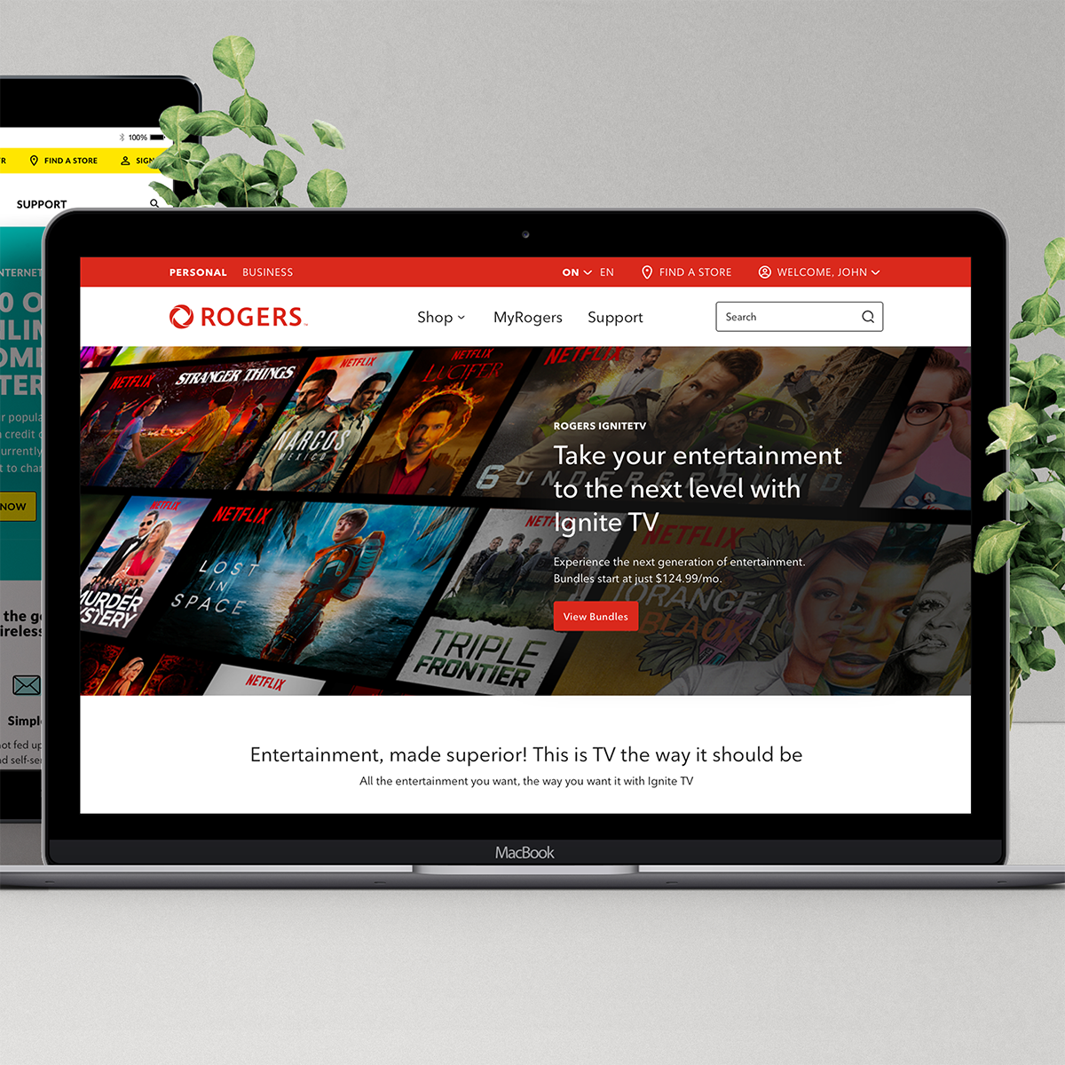
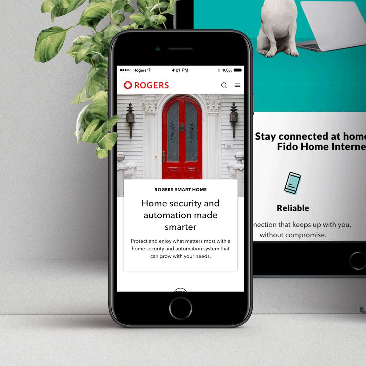
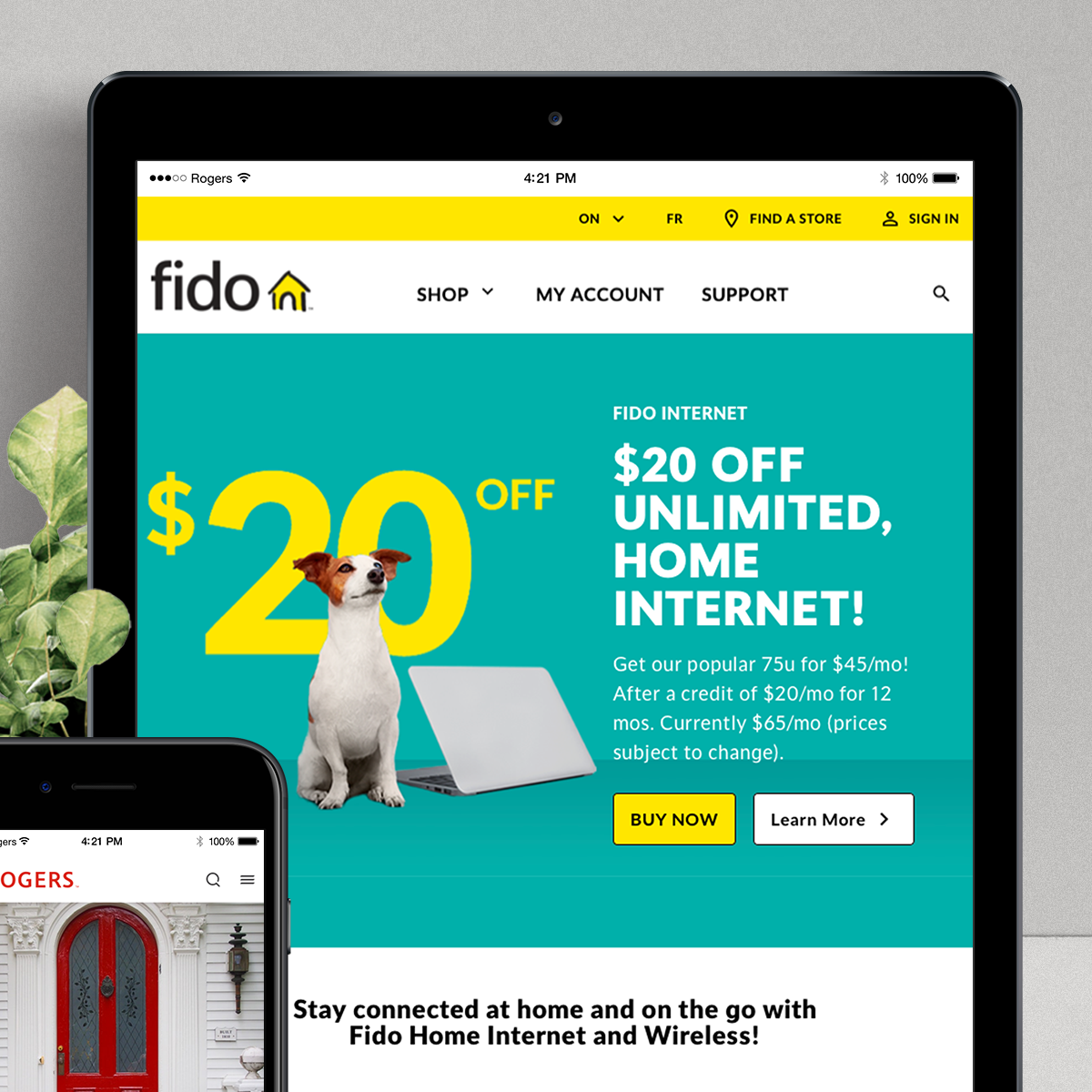
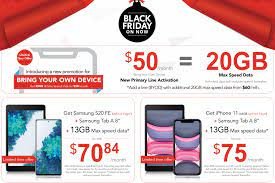
The ask was fairly straight forward - we are migrating from an old content deployment CMS platform to a new one - Contentful. We need a way to visually entice and engage our clients across various page levels and provide certain pertinent information, actions, and drive sales and adoption of new products. How can this be achieved? The ask came from our marketing and product teams. Everything currently existing in the system now severely lacks uniformity. Our design system at the time was fairly new, barely matured, and supporting very few applications. Our goal was to bring all of the marketing sites onto Contentful at this time as well. Learn pages in the Rogers ecosystem will all be the consumer of this new component, acting as a visual entry point to the product. It needs to be flexible, robust, and supporting dual brands (Rogers and our sub-brand Fido).
I was provided with the examples previously on the digital experience, functional requirements that were missing/lacking, and told to go and research best practices and experiences for this launch. During this time, I was working in tandem supporting all Q4 enhancements to our other components for this migration as well so this was another task with a tight deadline supporting the biggest sales period of the year.
Research & investigate
I started by reviewing any and all data provided by the product teams. This includes:
Journey Maps
Heat Maps
Experience IA
Previous explorations
Active visual treatments
Previous user testing data
Analytics
From the review of all this information, I’ve summaries the top 3 findings and poor experiences across the site:
User drop rates
When users navigate to our learn/promotion pages, the amount of drop off is severely impacted without a clear call to action. Jumping right into tons of information was also jarring to our user, and they felt overwhelmed by choice. Without a clear direction of the products we were serving to them, users pulled away from the experience and left all together.
OOH Impacts
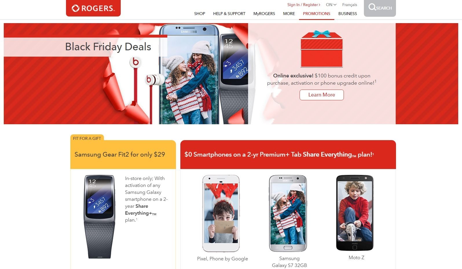
User testing told us that at the time of the previous campaign the year before, when users felt overwhelmed by the amount of information, they would often fall back on OOH campaign flyers, emails, or social media posts, or just go directly to the store or contact centre and ask about promotions. Our call impacts and store impressions shot up 36% around this time of year, which is a lot of manpower and support lost to other customers that have no other way to be served.
Visual Clutter/Mess
Users mentioned how lost they felt by the sheer amount of information being throw at them when landing on a page without a clear introduction. Many of our pages simply had a title alone, and no other way to welcome a user to the page, or give any clear hierarchy of the experience they were embarking on.
This keys points where going to be the main things I focused on when addressing this highly visual component. We would engage in similar testing to ensure success, and try to do as much pre-launch testing as time afforded. Due to some constraints, we would have to rely on post-launch testing, with future iteration in mind for greater use cases, and addressing any user feedback.
With these findings in mind, I started to research best practices and visual treatments through a competitive analysis, and see if I could find alignment that would support our type of experience we were looking for.
The main challenge here was that this new experience will have to act 2-fold. It needs to support all our Q4 initiatives, allowing for frequent update without deployment of new code, as well as supporting ongoing learn/browse experiences outside of campaign. Many have different asks and different needs. I needed to find the best way to support these two main goals, and deliver on this high-visual experience.
Competitive Analysis
I started by looking at our competition for inspiration. Beyond the obvious of the telecommunications industry, I find great inspiration looking at what others are doing in other industries, both digitally and physically in their space. What is a fashion blog doing to engage their clientele? How does a university engage their new students and faculty? How does packaging of a new cereal reach people? How do we judge a book by its cover, literally? I find it really important to step outside of my computer screen and take a look around and see what I can find.
Whiteboard Session
With the high-level research done, both through information provided and inspiration out in the world, I had a general idea of what we would visually want to happen. I started whiteboarding ideas and getting a solid treatment out and see if it could work, how it would be coded and implemented for users to use, and evolve our visual treatment for the brand.
During this exploration, I had been communicating with our Creative Design lead. We had a sticking point that the general treatment of requiring the test to sit on a white box on top of a background image was just a poor visual treatment, and frankly was boring. It distracted from imagery, and it often felt boxy and weird. When images weren’t carefully curated and produced to fit in the open area, you’d lose key areas of your visuals. We wanted to put text directly on our images but accessibility and readability is always a concern. How will we solve this?
We also had issues with other components on mobile looking exactly the same as our billboard. Our “Section” component had a relatively the same data structure, but less visual prominence on mobile screens. We needed a way to design this that more closely related our content to the visual assets on the page, and improve our hierarchy on our Billboard.

After all this conceptual thinking, I came up with a solid data structure to meet the asks of products, and the visual evolution we were hoping for. We would need:
Product tag
Meant to give a high-level introduction to the product, but also act as a marker for accessibility users to navigate the page with improved functions.
Title
Two different styles - one for main header of the page, and a visually different in-page treatment for an alternate variant
Body Copy
Because obviously
Legal
Because also obviously
Light and Dark Modes
The content and text will update depending on the variant of light or dark being chosen
Alignment
Right or Left alignments of the text box. This will automatically move the foreground image and was provided more control based on the background asset main content zone.
Buttons/Links
To be used sparingly, only really for navigation from homepage to product pages, or for service-ability checks to ensure customers are covered.
Background brand/product assist imagery
Finally going off-grid, but we need a way to not cut any important visuals off due to legal impacts from third-party suppliers like Samsung and Apple
Foreground device imagery
Due to aforementioned vendor requirements, we can’t have any content cut off during any responsive layouts.
Accessibility container to assist with improved readability
Very important, but a viable solution to still maintain clear legibility of text now living on a background image. More on this later.
Mobile-Friendly
We solved our visual treatment during our design phase over overlapping our content within a container, and centre-aligning our text for greater visual impact.
After I started putting all these concepts together, I had a review session with the Design System Manager, our creative lead, our technical manager for our CMS, and a few Product Owners for various LOBs.
The meeting was a success. Minor tweaks and considerations were improved upon and fleshed out during our build cycles to ensure it was responsive, and meeting all requirements for all our breakpoints. Documentation will be fleshed out to ensure understanding on asset creation, and design use of the symbols within our Sketch library. Now, let’s get to work designing this thing!
Designing and coding this Beast!
Our design system currently lives in Abstract, and all our files are made using Sketch. I quickly got to work during our next sprint, working in tandem co-locating with our developer assigned to our story. We did a review before work could begin, with the idea of getting the base functions laid out, allowing me time to formulate specs into our mocks for greater clarity. During this time, I also would create fully responsive and customized symbols in Sketch, so designers could make use of this while being pixel accurate to all functions that will now be included in this symbol. These include:
Optional content structures and being truly responsive to any customizations like text, imagery, content types, etc
Symbols for all four breakpoints (1200+, 900+, 600+, and 320+) to support any prototyping and mocks on various other products
Documentation around use
Any imagery considerations
We always review our work daily (or near daily) with dev/design/qa and stakeholders to ensure proper direction and solutioning are being adhered to. This ensure we stay on target for our quoted release date of the component. With time not on our side, we couldn’t afford any delays in release due to the upcoming dates for campaign.


Release
After the sprint cycle was complete, our component was released. On top of our visual design improvements, I updated our documentation, and created the first-of-it’s-kind image documentation resources. This included:
A tool to check accessibility compliance ensuring background images and foreground text remain accessible, and which opacity controls would need to be considered
Photoshop templates for desktop and mobile, built with image exporting in mine. This ensures that the images are formatted properly for CMS upload, as well as cutting down on page load. The highest quality at the lowest size.

Initial designer feedback was overwhelmingly positive. During this transition time between multiple applications, the content required was very ambiguous. This allowed for testing and tweaking of assets before it even hit the CMS. This was later requested and implements for other highly-visual components, and lead to an overhaul of our image documentation.
Feedback and Review
After release and implementation onto our CMS, the billboard was finally released for our Q4 promotional pages. Our initial feedback from our Product Owners was extremely positive, specifically noting that the documentation templates created for facebook allowed their asset designer to work more quickly, allowing the team greater velocity for updating offers multiple times through the day.
The general use of the new component was also extremely positive, noting improvements to the data model in our CMS allowed for more content to be expressed, and greatly improved our visual treatment on smaller breakpoints.
Feedback from our designers stated that the new Sketch symbols were easier to navigate, and allowed flexibility of their page mocks and prototypes with little overhead, and never required to detach from our symbols. This is extremely valuable feedback to ensure that we don’t have designers needing to break designs if they aren’t syncing with our codebase.
Our engagement in our new EOY campaigns increased significantly, with a decrease in Contact Center touchpoints by 23 percent. Our in-store engagement was still high due to the nature of our OOH campaigns and shopping behaviours during this period, however we did see greater end of quarter sales by 12% over the past year. Of course there was greater work than just this billboard. We improved or created another 8 components to support our new campaign pages and push our visual treatment, but the overall success was specifically mentioned during our org-wide quarterly review, giving special kudos to all who worked on our Q4 digital campaigns.
Post-Launch Evolution
Now that this component has released onto our design system, we always strive for the best knowing that design is iterative. Due to the nature of our codebase and our application structures from a technical side, new functions are always handled by the design system teams. We have iterated for greater use cases to support multiple products and applications beyond campaign releases.
We have since iterated on this in a few ways:
Slim Hero

New slimmer version to support tertiary landing pages, with stricter content guidelines. This will act more as an introduction to a page or as a title vs a large impress visual treatment.
Also supports on-page navigation with 3 tertiary in-page links to jump to specific relevant sections on the page
Countdown hero

A pre-campaign billboard containing a new countdown element. This is meant to engage users and gain hype before our campaign officially launches. It also acts as a gateway to our email signup, and keep in touch with our clients when the campaign launches
Search + Support Hero

A new support variant, offering a less marketing focus, but still allowing for that improved visual treatment. We’ve also pulled in the a search bar to support the Search/Support ecosystem.